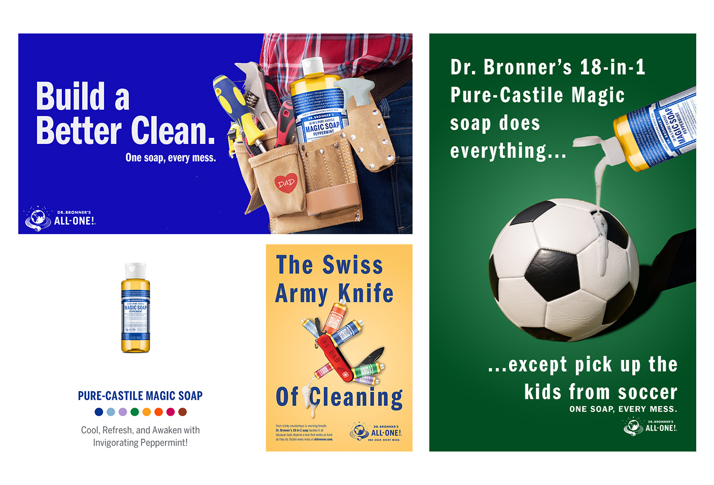
My team created a series of print and out-of-home advertisements for Dr. Bronner's with the goal of repositioning its 18-in-1 soap for stay-at-home dads.
The Task at Hand
For my Elements of Creative Advertising class, we were tasked with developing a cohesive print and out-of-home advertising campaign for a real brand. Our team worked with Dr. Bronner’s, a personal care company known for its eco-friendly, multi-use soaps. The objective was to reposition the brand for a new audience, stay-at-home dads, by creating three ads: a full-page magazine ad, a billboard, and a transit ad. Each piece needed to feature the product clearly, communicate a unified concept, and adapt to the strengths of its medium.
The Creative Process.
Design is never a straight line, so you have to learn to love the process. Every creator has a unique journey. Here’s a glimpse into mine!
Brainstorming
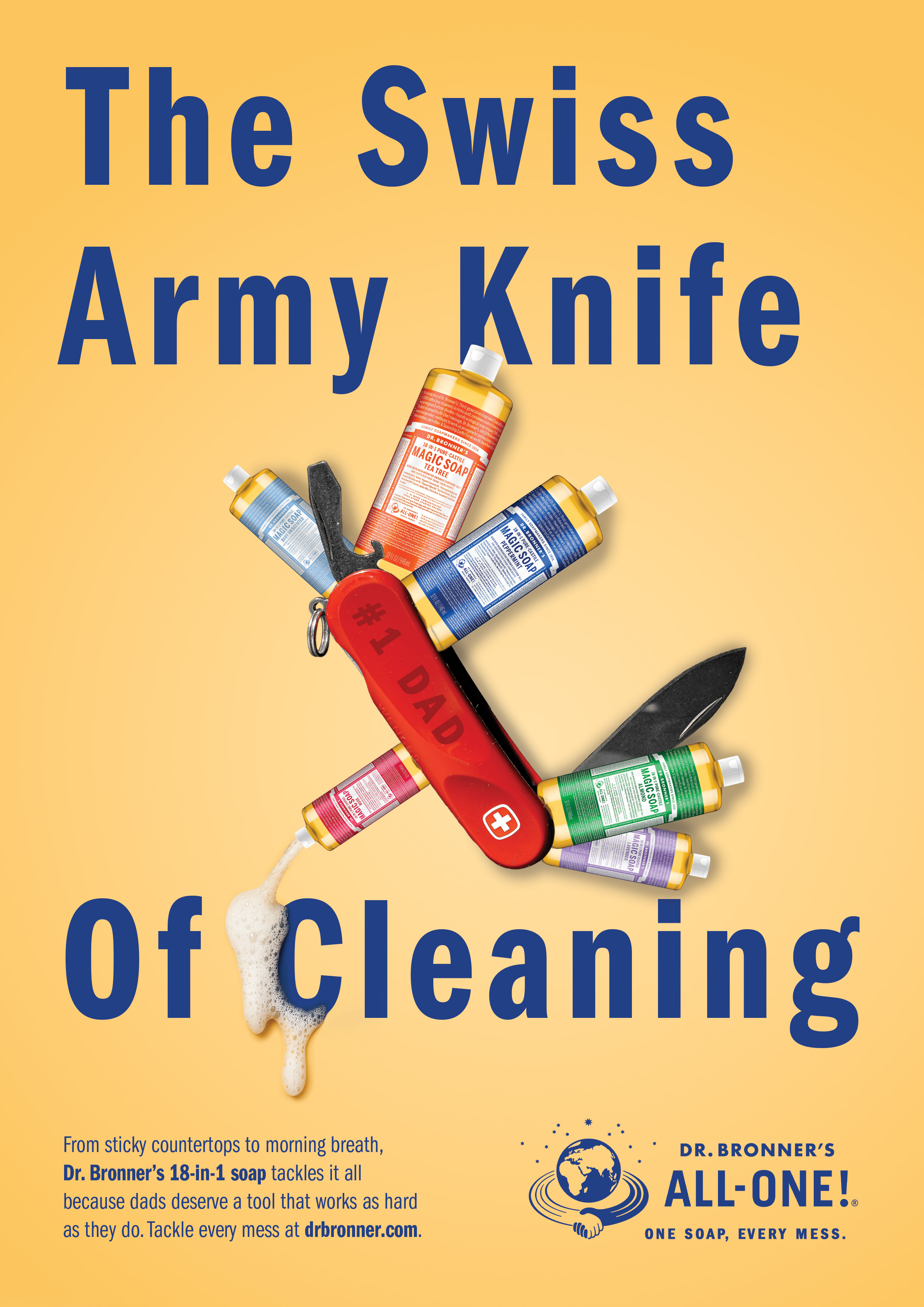
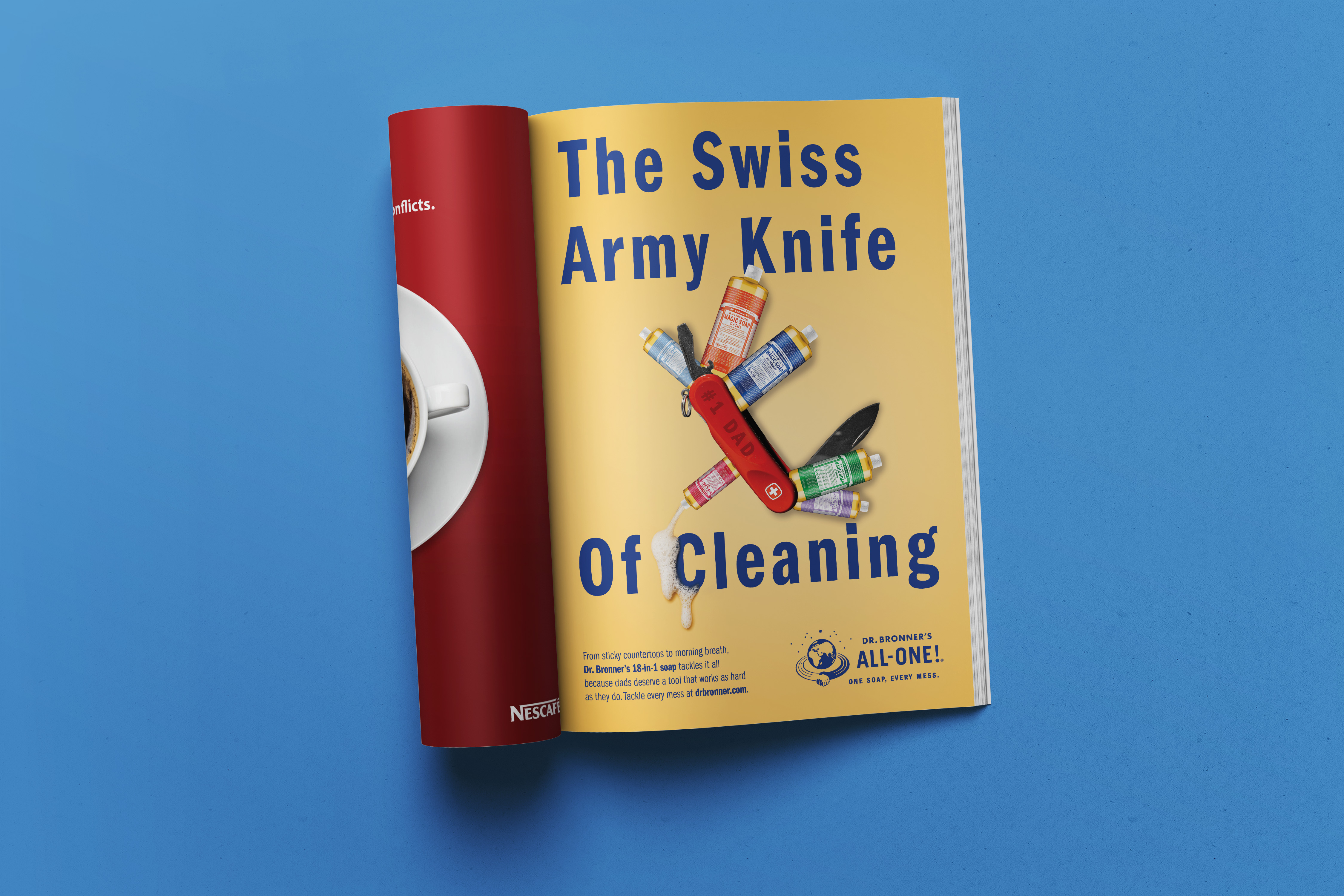
We started by exploring ways to reposition Dr. Bronner’s for stay-at-home dads. The big idea emerged: Real dads don’t need 18 products. Just one.
Target Audience
- Stay-at-home dads in the U.S., representing nearly 1 in 5 stay-at-home parents.
- This group values affordability, practicality, and clear guidance on product use.
Research
- Reviewed demographic data and lifestyle insights for stay-at-home dads.
- Identified skepticism toward multi-use products and concerns about safety.
- Analyzed social media conversations and user reviews to understand pain points.
- Found that dads appreciate cost-saving, time-saving solutions and straightforward messaging.
Insights
- Skepticism is common → messaging must build trust and show versatility clearly.
- Masculine, practical tone resonates more than overly eco-conscious language.
- Visuals should feel bold and uncluttered, emphasizing simplicity and control.
Creative Approach
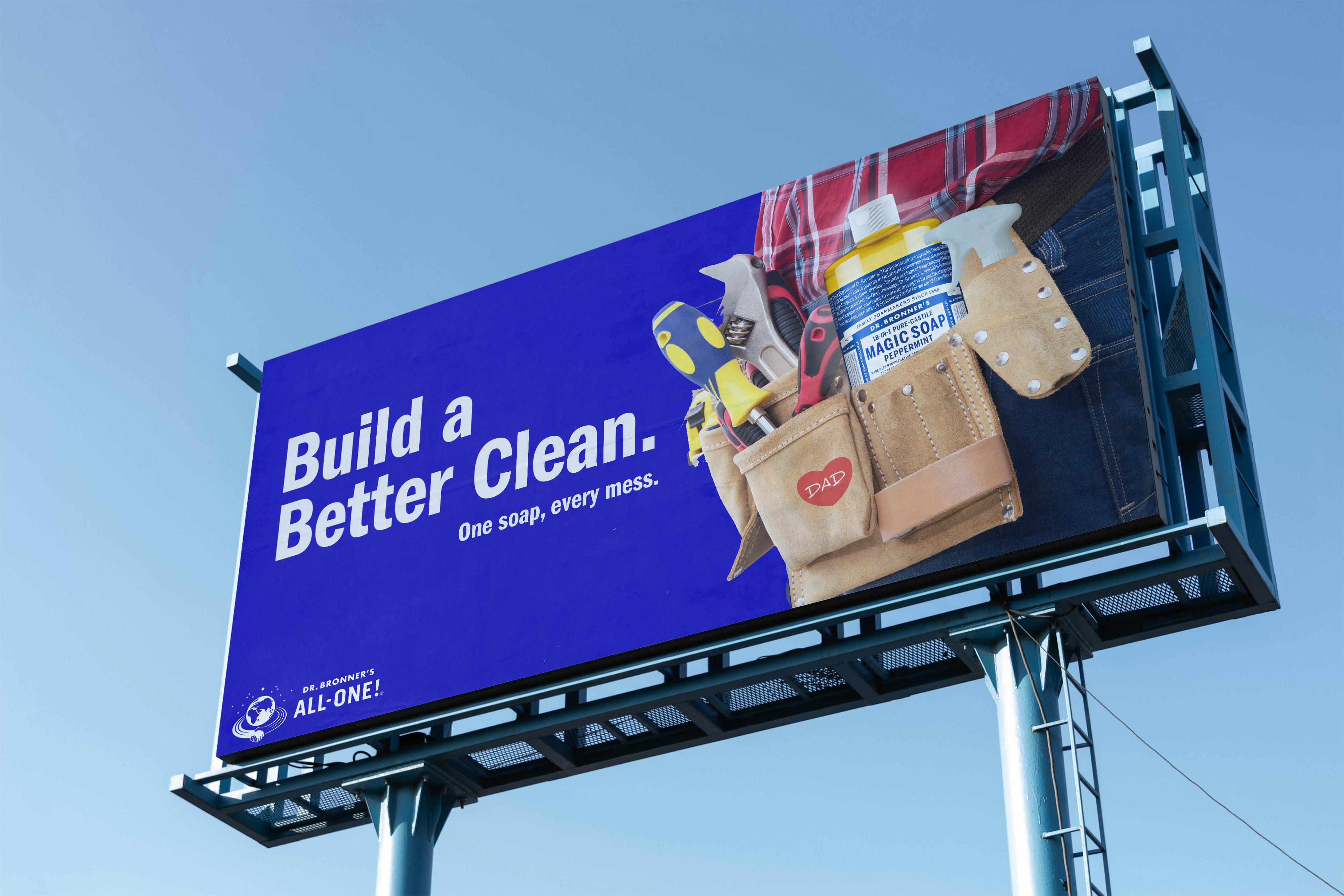
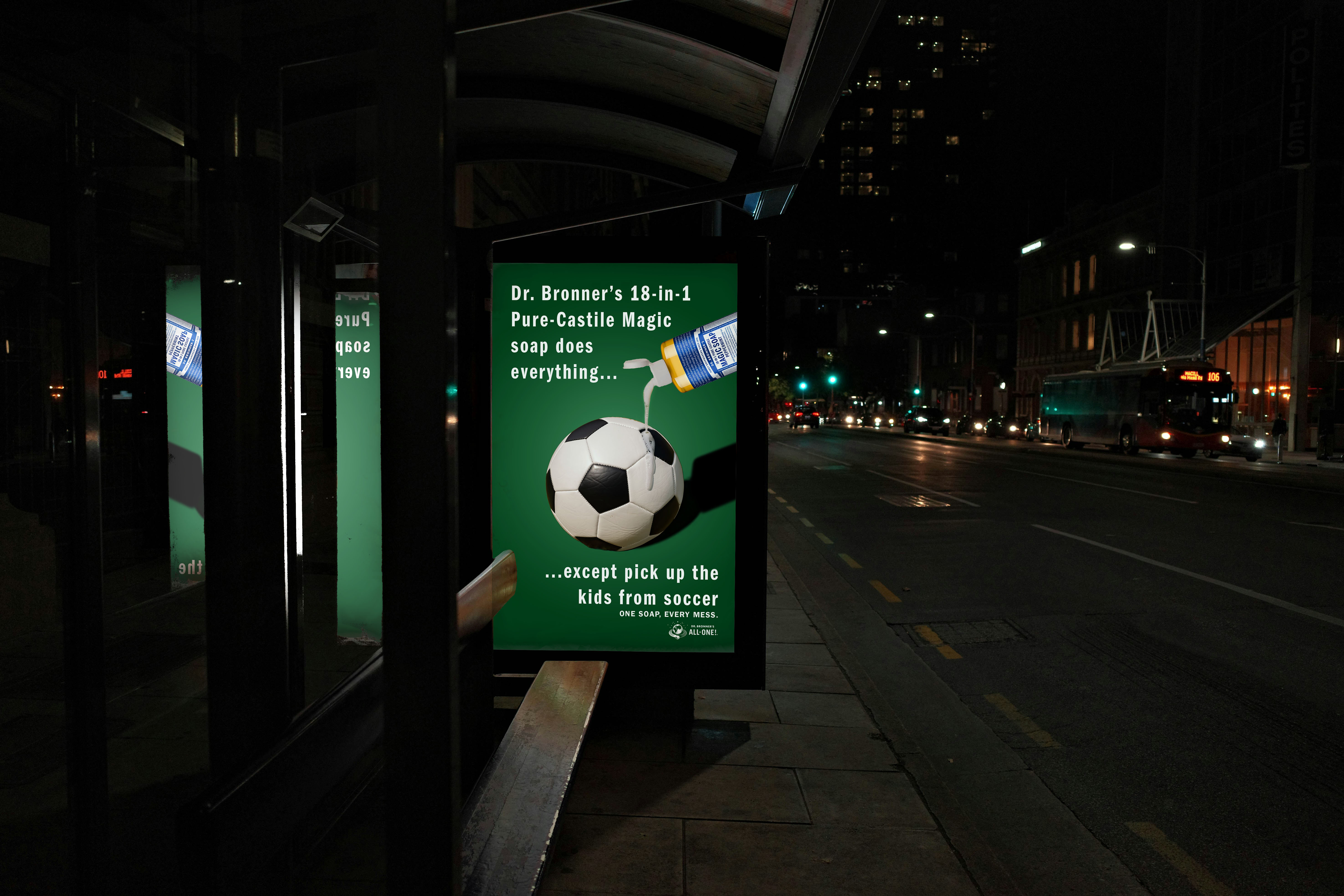
The campaign positioned Dr. Bronner’s as the “Swiss Army knife” of household care. We used strong, masculine typography, minimal layouts, and photography that highlights real-life utility. The tone was confident and no-nonsense, appealing to dads who want fewer products and more efficiency.
Visuals
- Sketching: Developed layouts for magazine, billboard, and transit ads with consistent hierarchy.
- Image Selection: Choose lifestyle photography showing dads using the product in practical scenarios.
- Graphics: Incorporated bold product shots and clean icons to reinforce versatility.
- Typography & Color: Used Dr. Bronner’s brand colors and fonts for recognition, paired with strong headlines for impact.
Feedback and Changes
After the first draft, we had a class critique session. Feedback focused on making the versatility message clearer and ensuring the ads adapted well across all formats. We refined copy for simplicity and adjusted layouts for better readability on large-scale OOH placements.
Working in a team.
I couldn't have done it alone! I had the pleasure of working on a team for this project, where each of us took on a specific role, but all worked together to ensure a successful campaign.
Art Director - Lexy Farinelli (Me!)
Account Planner - Mackenzie Cunnane
Copywriter - Anna Gabe
Dr. Bronner's
Print & OOH Ads
September 2025
To simplify the life of stay-at-home dads